Alpha Design Submission
A Fool's Run » Devlog
The last couple of weeks have been hectic. The team has been working round the clock on getting the game to work for the Alpha. Things we worked on and some Challenges we encountered.
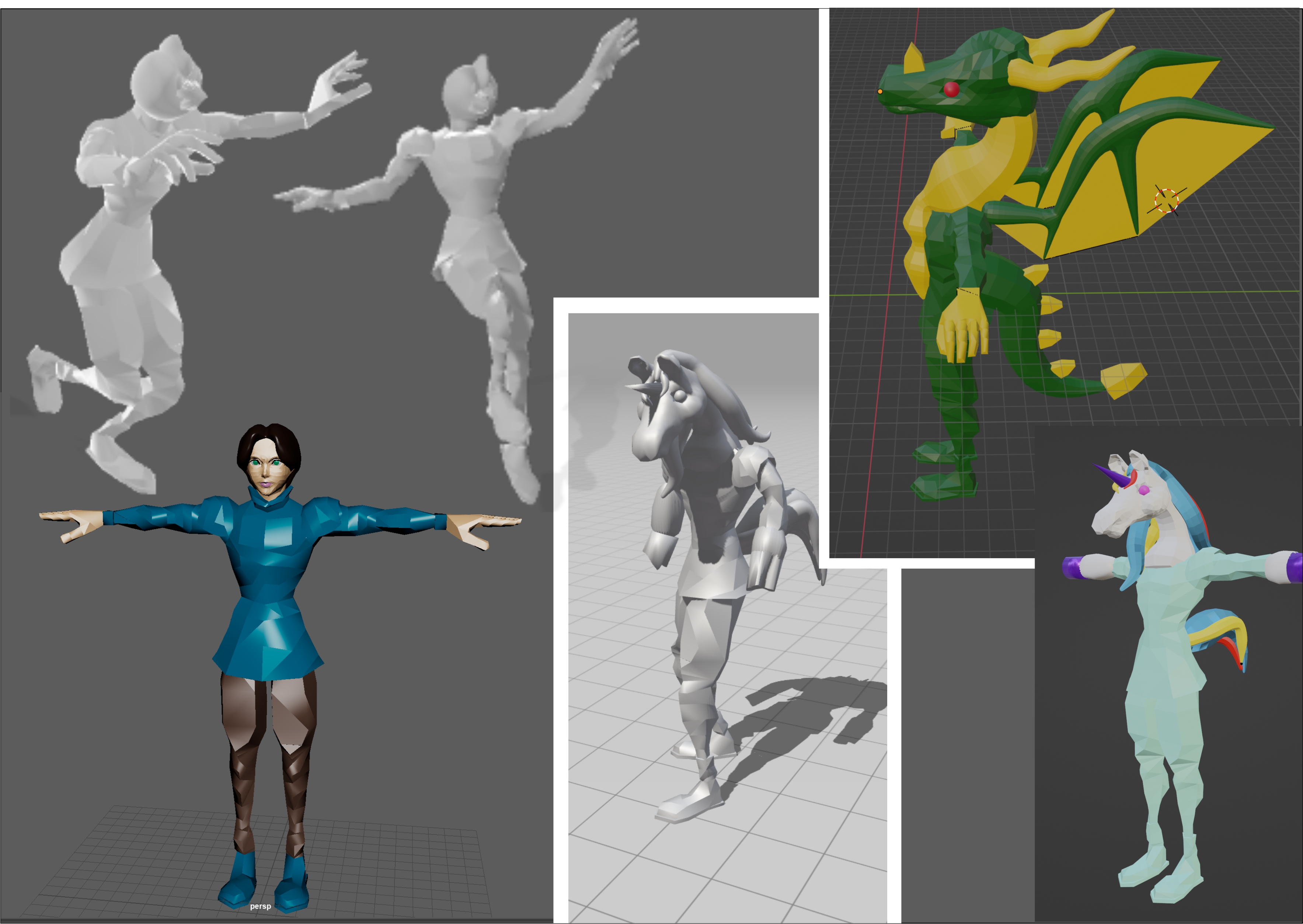
- Rigging the Dragon Character and animating it was a challenge, but we were able to rectify that by reducing the size of the dragon wings and tail. After our Alpha, we will review the dragon character and make adjustments. We weren't able to implement it into the game for our Alpha, the plan is to put it in the game for the Playtesting coming up next week.
- We have included some other sound effects and the witch’s voice over and this brought more life to the game.
- The art assets have been added with texture for the level design. We are still working on the art assets and improving the aesthetic of the game.
- The transformation of the main player to the chicken and dragon works well with the particle effect when they collide with the potion
- We were able to add the gems count and timer for the witch
- We worked on the technicality of movement of the player as a human and transitioning to one of the creatures, especially with the camera angle. This bit of the game has been a major issue, especially with some of the objects obstructing the camera view when a player is navigating through the stage.
- Review of the end gameplay.
- The art team went through the sketches made and all our art concepts to filter out what needs to be modeled and adjusted
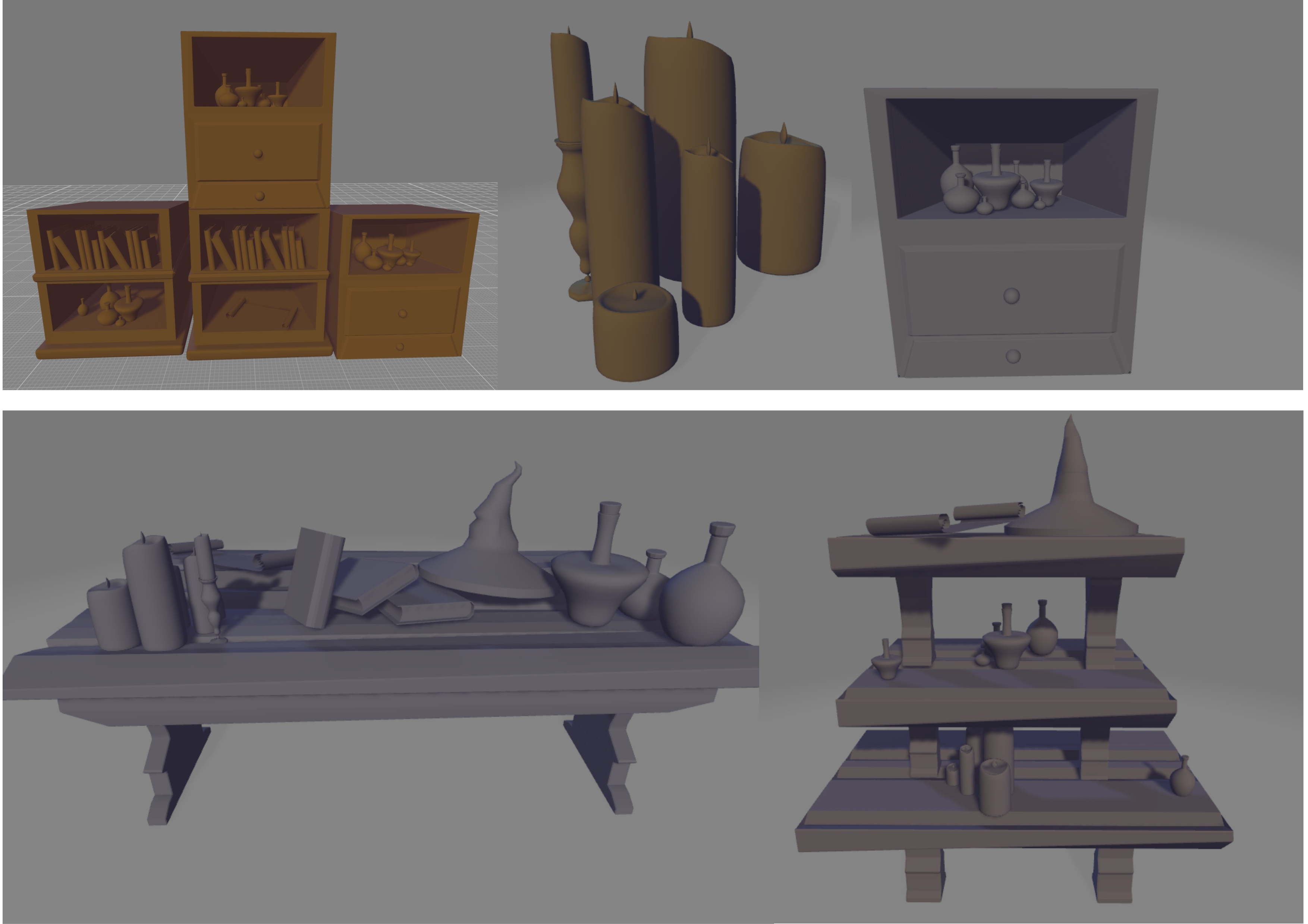
- The art team modeled the art assets for the environment like the Shelves, candles, books etc.
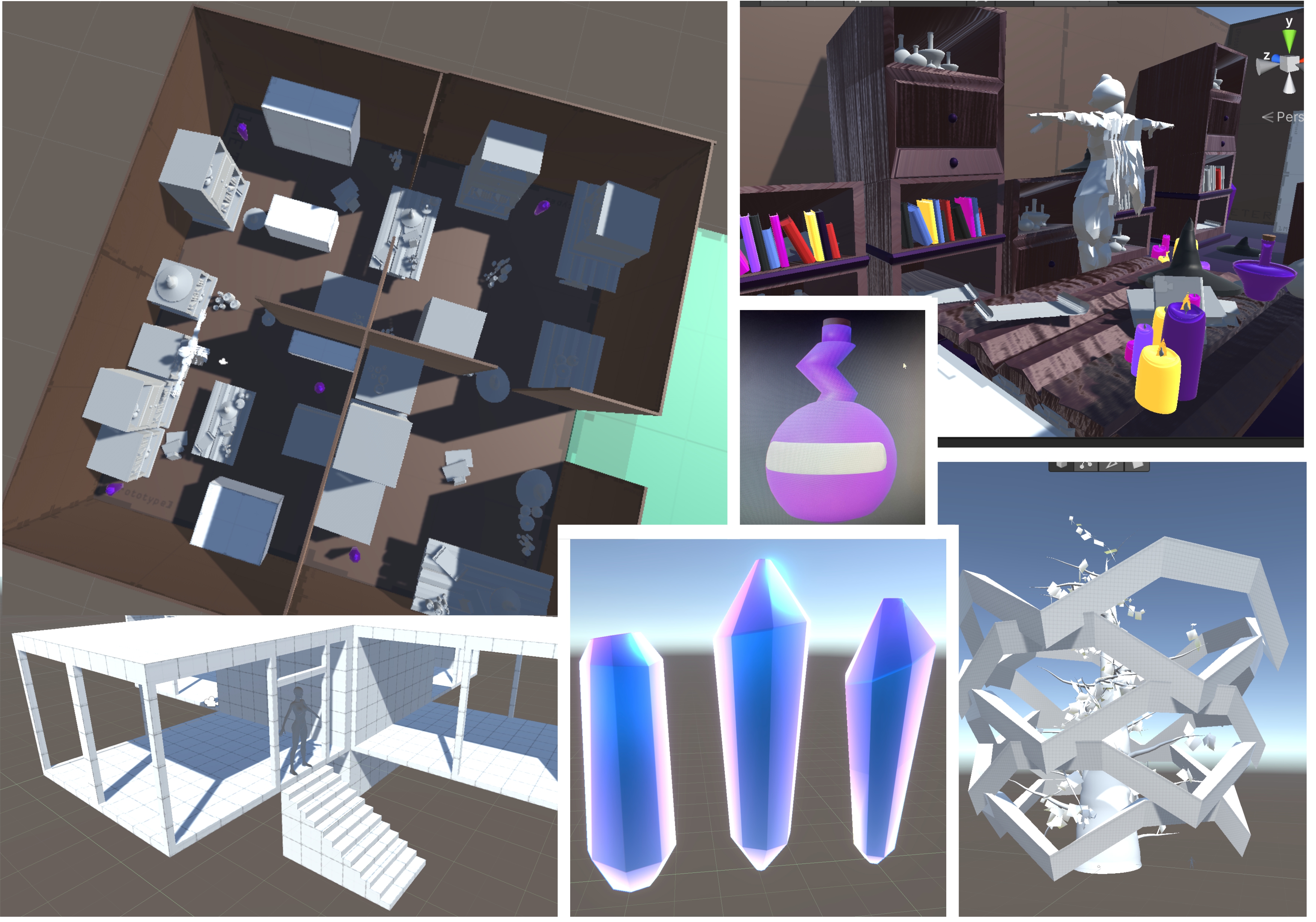
- A complete layout of level one and overview of where the obstacles are meant to be placed and the location of the gems
Feedback from the Alpha presentation
- When the timer is running out, the music temple should increase to give the player a sense of urgency.
- Cursor not confined to the screen, this will be a problem.
- Put a numeric value to the timer.
- The world was lifeless, work on the sound, have a crystal loop sound as you approach it
- The camera is a bit too messy/Camera Angle
- Make the character have different abilities and perform tasks unique to each, for instance, make a gem on the shelf so that the player can jump on the shelf to collect a gem. Be more strategic with the transformation.
- Make some things transparent if the obstacle is in view of the camera, make the obstacle stand out.
- The camera is too close to the player, we should see more of the environment.
- Let the player have a little more control on staying as a creature for a while.
- The art and models are amazing and that’s a lot of work that was put into it.
- The human and chicken character are great and looks like they have a lot of good details.
Some of the models and 3D sketches/ideas worked on by the art team.


Files
a-fools-run-alpha-build.zip 23 MB
Mar 04, 2022
Get A Fool's Run
A Fool's Run
More posts
- Completed gameApr 26, 2022
- PolishApr 18, 2022
- UpdateApr 09, 2022
- Playtesting Contd.Mar 27, 2022
- Alpha Release/PlaytestingMar 20, 2022
- After Design DocumentFeb 17, 2022
- Follow-up, Pre design DocumentFeb 08, 2022
- Welcome - A Fool's Run, the beginning...Feb 06, 2022
Leave a comment
Log in with itch.io to leave a comment.